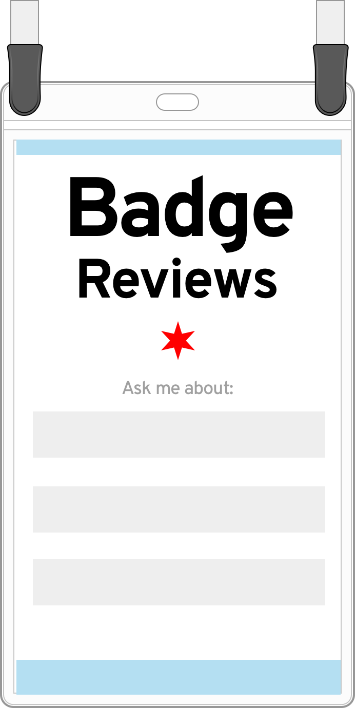

There needs to be a few rules when it comes to conference badges. After attending more than 300 conferences, it was a twitter moment from @therealfitz that sparked the core tenets of Badge Reviews. With people asking for their badges to be reviewed using #badgereviews, we have now put the design and philosophy into what makes a good badge here. A simple kit bundled with Overpass will help get you started too.
Below are some of the fundamental design rules to follow with the creation of your badge. For more reasons why, check out the article.
The first name should be large, 72pt minimum while the last name should be large too, but not take equal weight. The font should be easily readable. We recommend using Overpass.
Have attendees provide you 3 things they’re interested in. Put this on their tag in readable distance. This gives folks an excuse to look at someone’s name and create talking points.
Fifteen feet is your target goal for readability. Print your design early and often and test across the room in various lights for readability. Try long and short names.
Make the conference logo and title really small and put them at the bottom. Everyone knows what conference they’re at. Seriously.
Holders should not be able to flip over. Use badges and lanyards that utilize the top two holes in the corners of the holder.
Lanyards need to be adjustable in length and comfortable to wear for an entire day.
4” x 6” should be the standard size of the badge/holder. Yes, that big.