by Brian Fitzpatrick
November 9th, 2017
Founder & CTO: Tock, Inc. https://tocktix.com, Xoogler, Ex-Apple, Author, Co-founder of ORD Camp. ‘No Formal Authority’ — HBR ✶✶✶✶ Chicagophile ✶✶✶✶
Ten Rules for a Better Conference Name Badge
I’ve spoken at hundreds of conferences in the course of my career and the one thing that most of them have in common is crappy name badges.
I came face-to-face with this problem when Zach and I started running ORD Camp ten years ago: we started off with crappy name badges. Realizing that this was something we could control, I started thinking about what makes a good conference name badge and why. I subsequently ran several other internal conferences/summits at Google and these all gave me opportunities to iterate on badges and see what worked best to help attendees meet each other.
I’ve become, well, kind of obsessed with badges over the past few years, ranting about them to anyone in earshot, rating them on Twitter and hell, I even created one of those dreadful Twitter Moments with an initial draft of these rules.

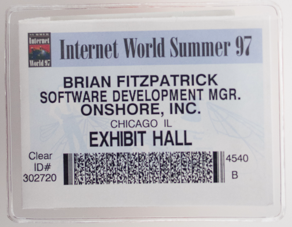
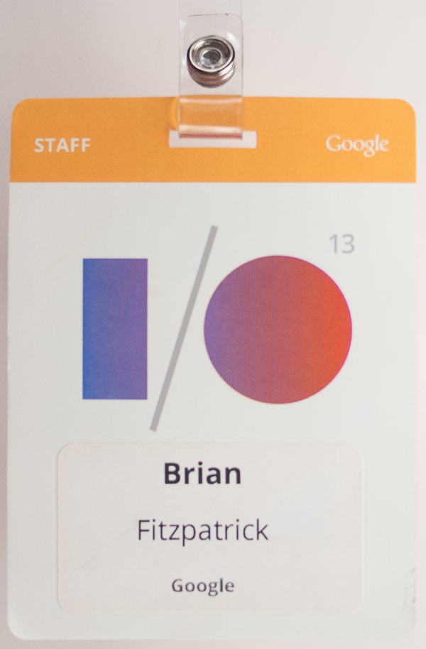
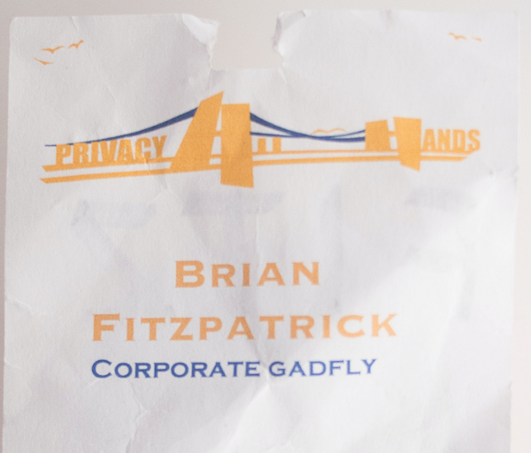
Of all the name badges I’ve ever had, this is probably the worst.
Why Name Badges Matter
People typically go to conferences for two reasons:
- To learn something
- To meet other people
Both of these reasons are really important parts of a successful conference. If the point of a conference is merely to learn something then it shouldn’t be a conference — it should be an essay, a book, a video, or (shudder) a webinar.
If you can learn something via other means, meeting new people becomes the most important part of a conference. But meeting new people at a conference isn’t a given for all of us.
Meeting new people can be difficult for many folks. Maybe you don’t know anyone at a conference. Maybe you’re not good at names and forgot the name of the person that you talked to for an hour last night. Maybe everyone knows you because you’re a speaker or well-known in your field and they met you last year, but you feel uncomfortable because you don’t even remember meeting them. Maybe you run into someone at a conference that you’ve never met In Real Life so you don’t even know exactly what they look like because their Twitter avatar is a picture of their cat. Whatever the reason, it’s really hard for some folks to meet and connect with new people, and bad badges don’t make it any easier.
So if we know it’s hard to meet and connect with new people at a conference, we can and should do something about that if it’s within our power. It turns out it’s very easy to do this: have name badges that make it easier for people to make new connections!
It’s not that hard to do if you follow these simple rules:
Rule 1
Everyone must wear a badge, no exceptions
This one’s pretty easy as most conferences also use badges to identify attendees. Badges shouldn’t just be checked at the doors though, all attendees should wear them at all times.
Why is this important?
To facilitate making new connections and meeting other people
Rule 2
It’s gotta be big
More on this below, but the tag itself needs to be big to accomodate the name printed large and some other basic information. 4" x 8" or 4" x 6" preferably.
Why is this important?
The name needs to be big and we want some other info on the badge.
Rule 3
Deemphasize the conference logo
I get that you want the name of your conference and/or sponsors right up in everyone’s faces, but cut it out. Make it small and put it on the bottom of the badge, and if you must put it at the top, make it small and subtle.
Why is this important?
We want to make it as easy as possible to read the name from a distance at a glance. Your bright and distracting logo at the very top of the badge makes this harder.
Rule 4
The name must be readable from at least fifteen feet away
“If it’s big and ugly, it’s not big enough.”

My name is in 13 point type on this tag. Srsly.
You should be able to read a badge with a quick and non-obvious/non-lingering glance from a distance. Use a non-serif font designed to be readable from a distance like Highway Gothic (free) or ClearviewHwy ($$) which were designed for interstate signs. The name should be truly enormous which means at least 64 point type, preferably 72 points.
Why is this important?
An important part of meeting new people is knowing what their name is, so if you want the people at your conference to meet new folks, you should make it as easy as possible for them to learn each others’ names.
With a good badge, introductions are easier and it’s much less awkward to run into someone you know whose name you’ve forgotten. And importantly: If the badge wearer is a woman, you’re not asking other attendees to stare at her chest which is incredibly uncomfortable for the badge-wearer. Discourage creepiness!
Rule 5
Give people another reason to look at name badges
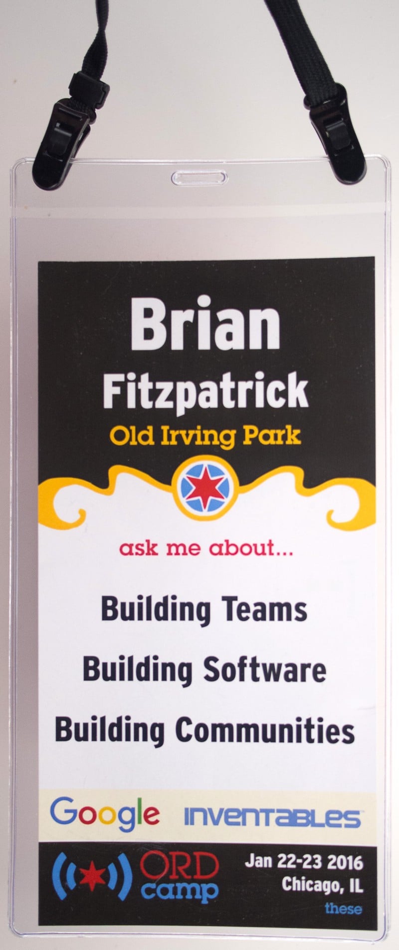
And I don’t just mean employer or title (in fact, I’d discourage folks from using employer or title on most badges as it can be uncomfortable for some folks), but rather something interesting like a few topics you’re interested in talking about (like the “ask me about” on my tag at the top). Also it’s nice to allow your attendees the option to add pronouns to their badge.
Why is this important?
Interested topics can be a great conversation-starter! If I’m super excited about typesetting and your badge says “ask me about linotypes,” you can be damned sure that I’m going to start up a conversation with you. Also, if you join a small group of folks talking and you don’t know one, you have an excuse to look around at badges to see everyone’s name. Lastly, if you find yourself in the dreaded “I forgot that person’s name” zone, you’ve got an excuse to glance at their tag.
Rule 6
DON’T USE ALL CAPS

This illegible low-contrast ALL CAPS tag tore in the 1st hour of wearing it.
Why is this important?
Because it’s harder to read ALL CAPS at a distance.
Rule 7
No flipping
The lanyard shouldn’t allow the badge to spin, flip, tilt, or otherwise do anything but lay flat against the person wearing it.
Why is this important?
If the badge’s lanyard has one attach point, it’s going to spin, and unless you print the same thing on both sides (and you shouldn’t), half the attendees are going to be walking around with a badge that shows the agenda or a map of the location. This totally defeats the purpose of having a name badge in the first place, so look for a lanyard that attaches at both top corners of the badge holder (and a badge holder that has holes on both corners).
Of course you can just print the same thing on both sides, but why not use the backside for something useful like a map of the space or basic agenda information? And if you do, print it upside down so that it’s easy for the wearer to flip it and read it.
Rule 8
The lanyard should be adjustable
Why is this important?
Not everyone is the same size/proportions and it’s best to allow the wearer to adjust the tag so that it looks appropriate on their frame. Also, as I said above (and it bears repeating) if the badge hangs awkwardly on a woman’s chest, it invites creepiness. Discourage creepiness!
Rule 9
Keep it simple
Avoid the temptation to make your badge into an art project.
Why is this important?
Low-contrast type, abstract shapes, odd patterns, and names printed top-to-bottom or on the bias all make it harder to read the badges.
Rule 10
Ditch that QR code!
If you need a QR code, then put it on the back of the badge!
Why is this important?
They’re ugly as hell. And they create an awkward situation of standing there while someone points a cell phone camera at your chest. Discourage creepiness!

A 4x8" badge that follows all the rules.
Bonus
If the folks attending your conference are big social media users, find a subtle way to put things like their Twitter handle on their badge.
Give it a try!
If your attendees are wearing a name badge anyway, why can’t it be a good one?
I suspect that there are two reasons why most conferences have awful badges:
First, when you’re running a conference you’ve got a million moving parts to worry about — it’s stressful and exhausting, and it’s easy to overlook details like badges.
Second, good name badges are expensive. Your average cheapo spinny non-adjustable 3x4" badge probably costs about $0.60 while the badge at the top of this article costs something like $2.00. This might seem like a lot for something most people are probably going to throw away when the conference is over (unless you obsess about name badges like I do), but during the conference a good badge that helps attendees do the most important thing they’re there for (to meet new people!) is worth way more than $2.00; it’s invaluable.
Special thanks to Erica Baker, Lucianne Walkowicz, Conrad Fuhrman and many others for contributing ideas to this essay.